|
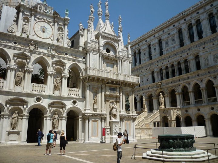
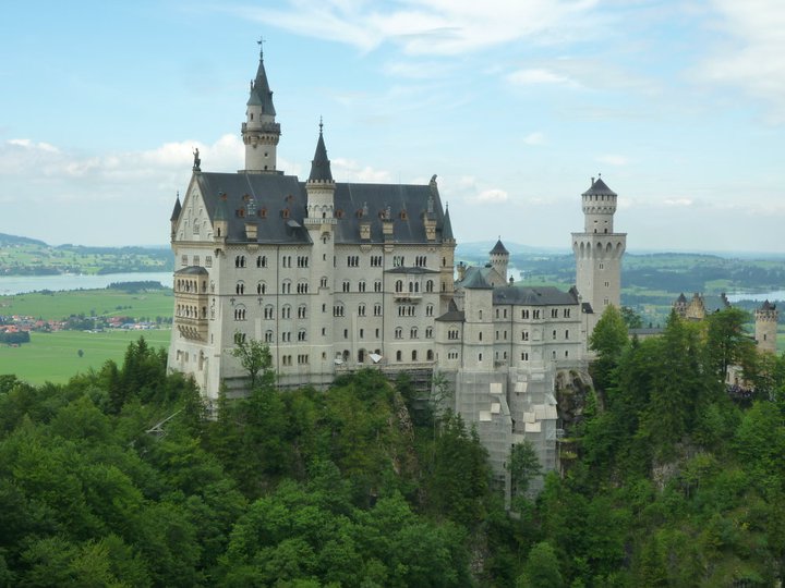
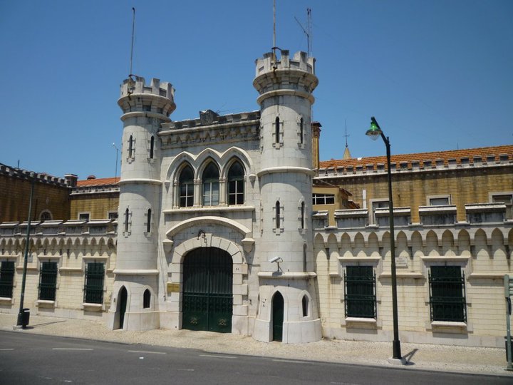
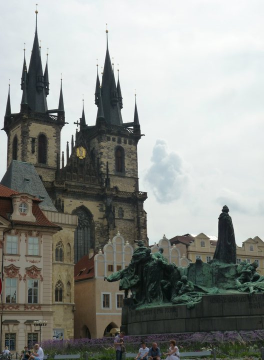
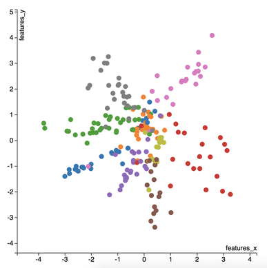
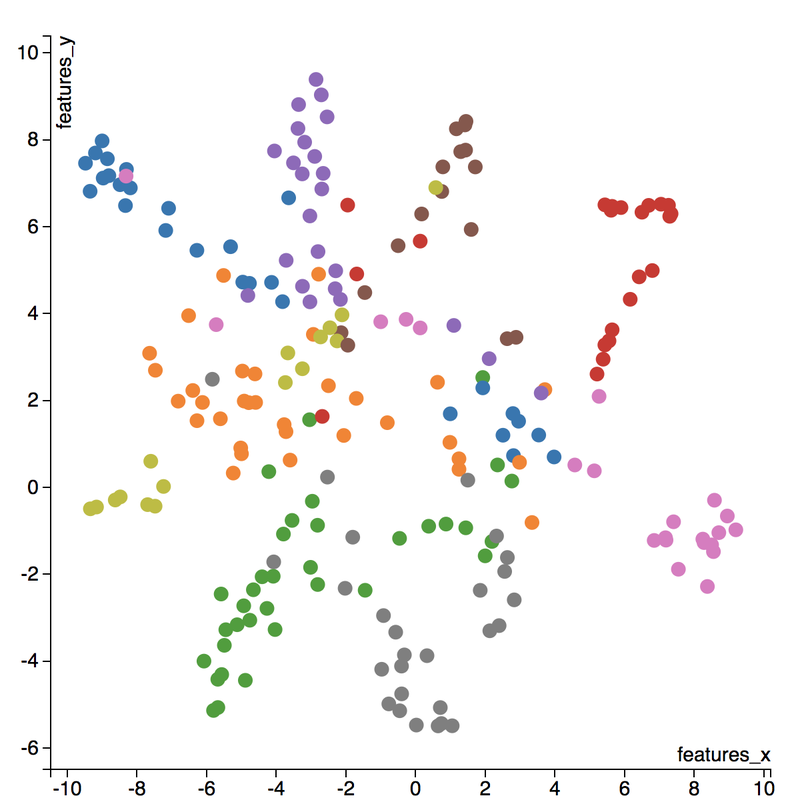
I love to travel. After graduating from university in 2010, I went on a two-month backpacking trip through Europe where I visited 10 different countries and took well over a thousand photos. Aside from trying new foods or learning about the history, one of my favourite things to do during my trip was to take pictures of all of the amazing buildings I came across (here are just a few of the pictures I took during that trip). For architecture enthusiasts, determining a building's architectural style comes down to pattern recognition, and being able to discern shapes and characteristics of a building. If the building has eccentric/irregular forms or sweeping curves (like Casa Milà above), chances are the style is Art Nouveau. Or maybe the building has many arched windows and tall spires (like the Church of Our Lady before Týn), then the building is likely to be Gothic style architecture. For this project, I wanted to explore whether a machine can be trained to recognize these patterns by applying a deep convolutional neural network (CNN) to classify a building's architectural style based on images. Furthermore, to better understand how the trained neural network perceives similarities of building based on images, I wanted to explore two different dimension reduction techniques: variational autoencoders and t-stochastic neighbour embedding (t-SNE). Both of these techniques find faithful representations of high dimensional inputs (like image data) and transforms them into lower dimensions allowing us to more easily make spatial comparisons between images. In this blog post, I will go over my process of using transfer learning to solve my classification problem by fine-tuning a deep learning model in Keras, as well as using Keras and scikit-learn to train a variational autoencoder and to apply t-SNE. Problem Overview Architectural styles often build on one another, with each past period providing inspiration for the next culture. For this project, I decided to choose architectural styles for my target variables that are more distinct and with less overlap in the historical timeline. To this end, I chose 9 different architectural styles to focus my analysis on: Chinese, Romanesque, Gothic, Renaissance, Russian, Neoclassicism, Art Nouveau, Art Deco, and Modernist. Transfer Learning The idea of transfer learning is using pre-trained image models (such as VGG16, VGG19, or InceptionV3) and retraining them on a distinct image classification task. I used the pre-trained InceptionV3 model for this project, and Keras documentation explains step-by-step how we can fine-tune this model to solve our classification problem. 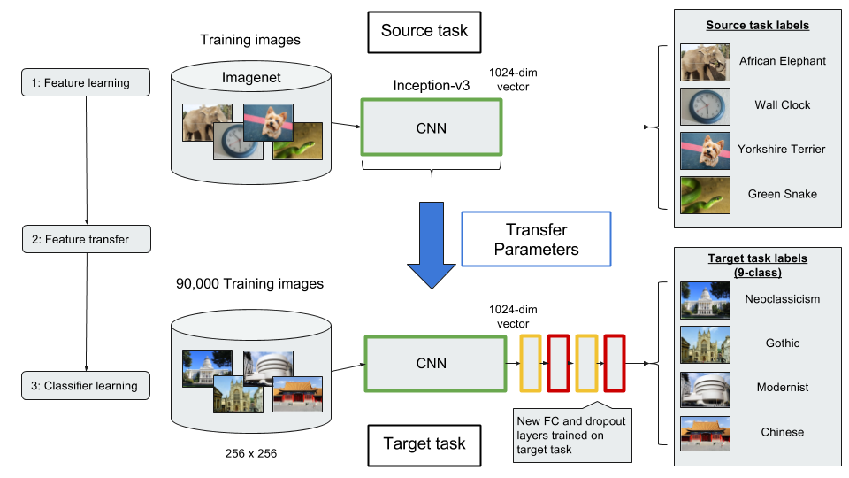 Transfer Learning on InceptionV3 model InceptionV3 is a model trained by Google to classify an image across 1000 categories supplied by the ImageNet academic competition, and has an error rate that approached human performance with a top-5 error rate (how often the model fails to predict the correct answer as one of their top 5 guesses) of 3.46%. Since the early layers of InceptionV3 has captured universal features like curves and edges and are still applicable to other problems with natural images, we want to protect these lower-level features during the back-propagation pass by freezing the weights of the bottom layers of our neural network from updating. Next, I truncated the original softmax layer and replace it with my own classification layer to solve my nine class classification problem, and added two dropout layers prior to this classification layer. Dropout is a regularization technique where randomly selected neurons are ignored during training (the process is explained in this post) to reduce overfitting in neural networks. The below code shows the final architecture of my convolutional neural network. 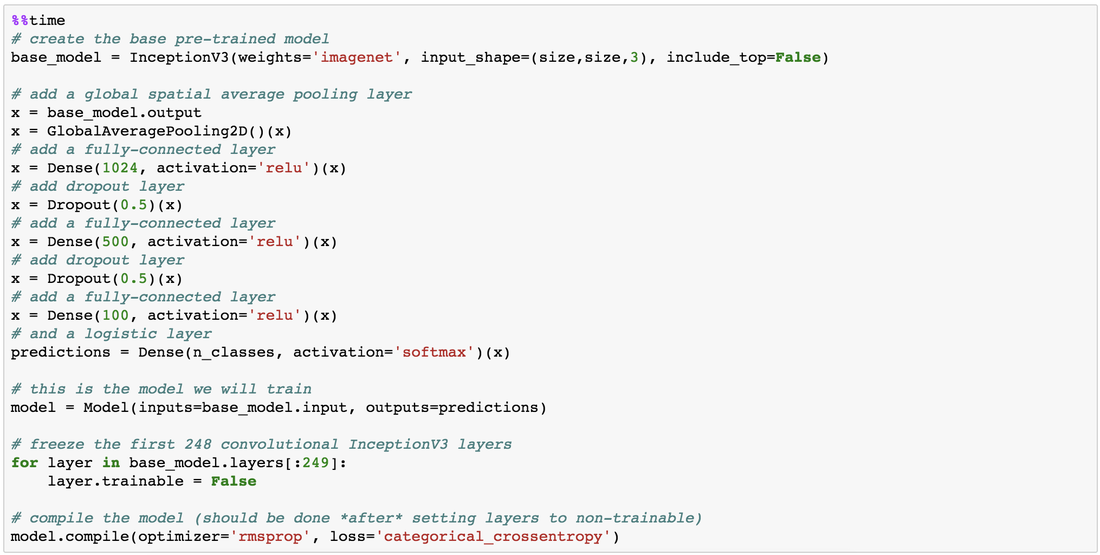 Convolutional Neural Network Architecture Getting Data One advantage of using transfer learning is that you don't need as much data as you would need if you were to train a convolutional neural network from scratch since Google has already done most of the hard work. Another technique we could use to reduce the number of sample images we would need to train our CNN is use image augmentation to increase our number of training samples. To get my training images, I downloaded the images from Google search results of my nine architectural styles using a Firefox add-on called Google Images Downloader. The search results needed to be manually curated to ensure that the image was in fact the correct architectural style as the search parameter, and also to remove any borders or text that may also appear in the image. The search result produced approximately 300 unique photos for each of my target classes (around 2700 images in total). Once I was confident that the sample images were ready to be applied to train my neural network, I first set aside 100 images per target class to be used as a holdout set on my trained model before I processed the rest of my images to be used as a training set. The image processing procedure consists of downsampling my input images to reduce my image size to 256 x 256 pixels. Downsampling input images is a common practice to ensure the model and the corresponding training samples (from a single mini-batch) can fit into the memory of the GPU. I then created synthetic training samples by blurring the input images and applying random translations and rotations. Training on this augmented dataset makes the resulting model more robust and less prone to overfitting. The resulting dataset consisted of 10,000 training samples for each target class, or 90,000 total training images. Setting Callbacks and Model Fitting Callbacks are a set of functions within Keras that allows you to view each state of the model during the training process. For my use case, I was particularly interested in using ModelCheckpoint to save the weights of my model after each epoch, and also EarlyStopping which allows the model to stop training when a monitored quantity (such as validation loss) has stopped improving. A list of callback functions and how to implement them in Keras can be found in the Keras documentation here. 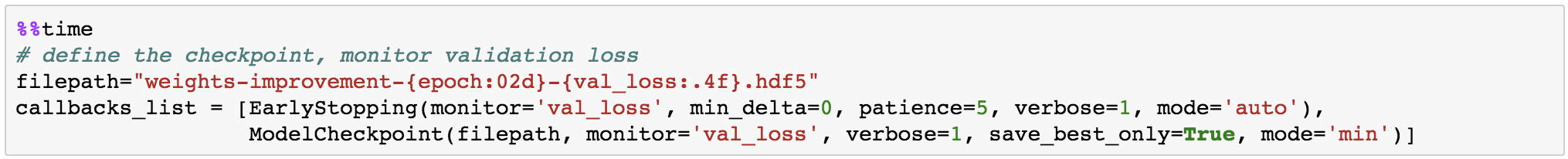 Keras Callback Functions Once my callback functions have been defined, I'm ready to fit the model. The documentation for the Keras fit method and the list of parameters that can be tuned can be found here. By setting an early stopping argument, I can safely set a large number epochs to train the model since I can be confident that once my validation loss has stopped improving, the model will stop training and the weights for the best validation score will be saved. The next parameter that can be tuned is batch_size, which defines the number of samples that will be propagated through the network per gradient update with a default value of 32. A lower batch size has the advantage of requiring less memory and the network typically converges faster as the number of gradient updates is considerable higher than batch gradient descent. A validation set can be held aside to be evaluated on after each epoch by setting the validation_split parameter with a number between 0 and 1, which represents the fraction of the training set to be used as the validation set.  Keras fit Method Classification Metrics After testing different dropout values as well as batch sizes, the values that resulted in the best validation score were: dropout = 0.5, batch_size = 32. I set the patience = 10 (number of epochs with no improvement after which training will be stopped) to be confident that my validation loss has reach a minimum. The below plot shows the bias-variance tradeoff in action, and we can see that after 6 epochs the model is starting to overfit (validation error increases dramatically). 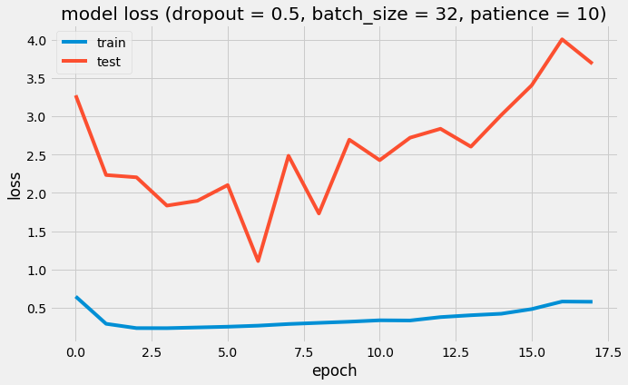 Training and Test Error The resulting model was able to achieve a top-1 error rate of 19.11% and a top-3 error rate of 4.89% when predicting on the holdout set, and below is a confusion matrix for that data. As a reminder, my holdout set consists of 100 samples of each target class, and the images are set aside prior to image augmentation. From the confusion matrix, we can see that Chinese architecture is quite distinct from the other classes, being accurately predicted 97% of the time. The model has the most trouble classifying Renaissance architecture, being accurately predicted only 60% of the time. From the confusion matrix we can see that the model falsely predicts Renaissance as Neoclassical 19 times. Based on the results, we can also see that Renaissance buildings share similar characteristics as Gothic and Romanesque architecture as they are most commonly misclassified. 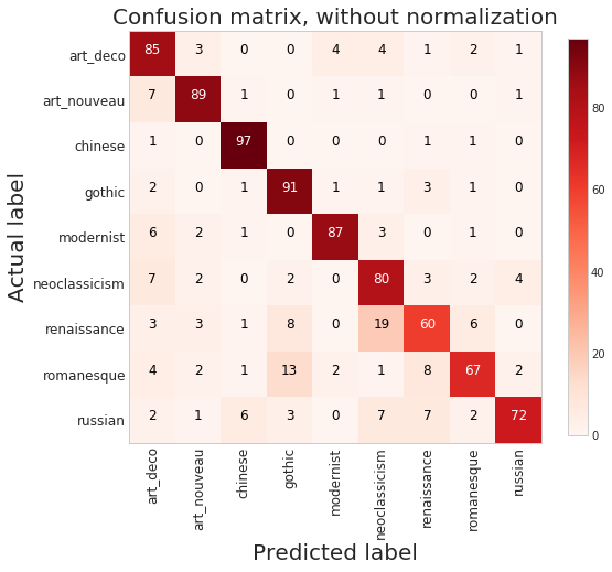 Data Visualization How can we measure similarities between two images? A convolutional neural network looks at an input image through windows in order to find the most important features for classification. For example, a CNN's bottom layers can learn to recognize lines or curves, while its top layers can learn to recognize arches or spires. By truncating the classification, fully-connected, and dropout layers, an input image can be fed into my trained CNN and the output would be a high-dimensional vector of features (in my CNN architecture, the output would be a 1024-dimensional vector). The relative similarity of images can then be calculated based on either cosine similarity or Euclidean distance of these vectors. What if we want to visualize the relative similarities of all the images in our dataset? Unfortunately, human imagination is fairly poor beyond three dimensional data. We need to find ways to reduce our 1024-dimensional data into lower dimensional features and project them into a latent space so that we can visualize them. I will talk about two ways to achieve this: by training a variational autoencoder to learn representations of the input data in lower dimensional space, and by applying t-stochastic neighbour embedding (t-SNE) which maps high dimensional space to a 2D or 3D space. Variational Autoencoder Variational autoencoders (VAE) are a class of unsupervised machine learning models used to generate data, like Generative Adversarial Nets (GAN), and is rooted in bayesian inference in that it learns a latent variable model (parameters of a probability distribution) for its input data and then samples from this probability distribution to generate new data points. There are two main components of an autoencoder: an encoder that compresses high dimensional input data to a bottleneck layer (which is a lower dimensional representation of the input), and a decoder that takes the encoded input and maps these latent space points back to the original input data. The latent space is the space in which the data lies in the bottleneck layer. 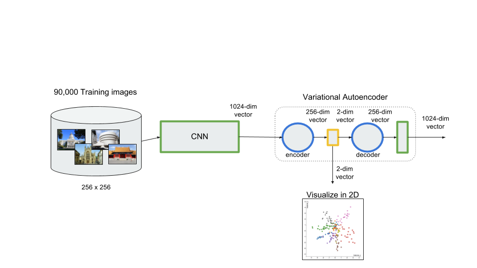 Variational Autoencoder Two practical applications of autoencoders are data denoising, and dimensionality reduction for data visualization. Documentation on how to build autoencoders in Keras can be found here. Using the same 90,000 image training set and 100 image test set I used to train my CNN, I fed these images into the trained CNN with truncated top layers to get 1024-dimensional feature vectors of the training and test images, before applying a MinMaxScaler and using the output to train my variational autoencoder. Once trained, the encoder is able to take any input image and transform it into a 2D representation in the latent space. To understand how my convolutional neural network perceives similarities in images, I took a sample of 223 "famous" buildings around the world where each of my nine architectural styles are represented. The list of buildings, labels, and the image URLs can be found here. I took the representations learned in the latent space and plotted these 2D points in the plot below. The nine different colours represents the nine different architectural styles, and without knowing any of the labels, the variational autoencoder has done a pretty good job clustering these images based on architectural styles.
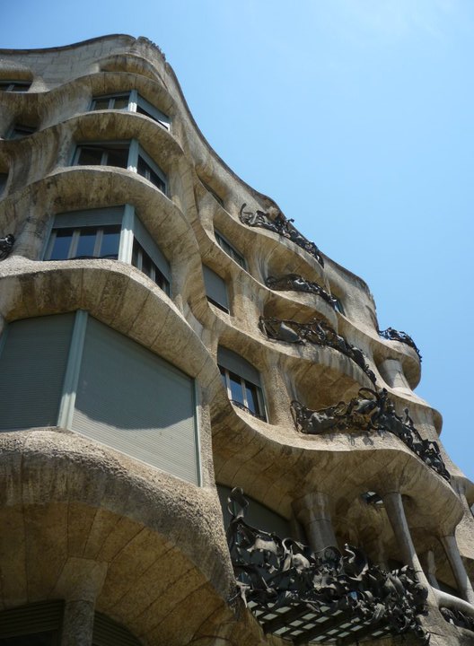
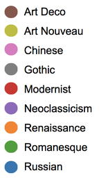
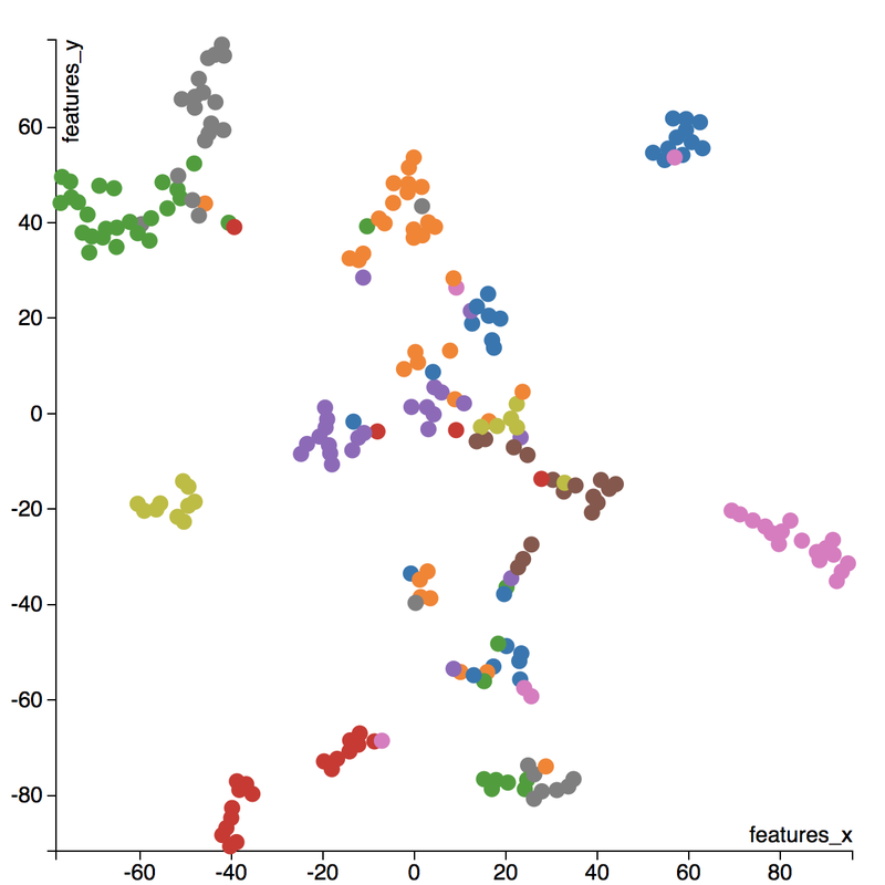
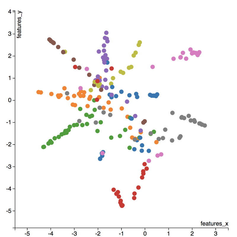
A few insights can be drawn from this plot. Firstly, there is a clear radial shape to the distribution of images, with each spoke representing an architectural style. What is interesting is how the images of Renaissance buildings, represented by the orange dots, are centred at the hub of the radial shape. This result is aligned with the results from the confusion matrix above, where we saw that the Renaissance labeled buildings seem to be the most difficult to classify. We can also see that Renaissance, Gothic, and Romanesque images are relatively close to each other in the latent space, which is a result that was also shown by analyzing the confusion matrix. The pink spoke representing Chinese buildings has a greater angular distance than the other classes, which may suggest some defining characteristics that differ Chinese buildings from other buildings. An educated guess would be that the neural network has learned that sweeping roofs, often characterized in Chinese architecture, is an important feature for classification. Another interesting thing to point out is if you look at the Modernist buildings represented by the red dots, you can see that even though they are clustered together, they are more spread out compared to the other classes, which may suggest that even though those buildings share similar characteristics, such as clean lines or sleek minimalistic styles, they are still very different looking from each other. The video below is visualization I created using d3.js that shows the image of the building that the point represents by hovering over it. By looking at nearby points, it allows us to make spatial comparisons between the images. 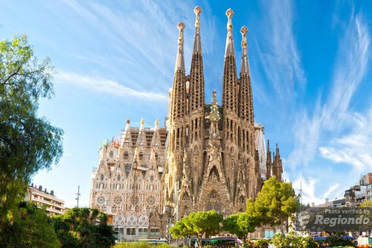 Sagrada Familia Sagrada Familia The video below shows a demonstration of a predictor application I created using Flask and d3.js. Let's say we want to know the architectural style of the Sagrada Familia (pictured on the right) in Barcelona. In the demonstration, I have inputed the image URL in the input field. The application will make a prediction from the convolutional neural network model of the building's architectural style. In this case the model has predicted that the Sagrada Familia is Gothic style architecture. It then finds a 2D representation of the input image using the trained variational autoencoder and plots a point at that location in the latent space, allowing us to look at the dots that are nearby to see which buildings share similar features. t-distributed Stochastic Neighbour Embedding t-distributed stochastic neighbour embedding (t-SNE) is a machine learning algorithm for dimensionality reduction that is particularly well-suited for mapping a high dimensional space to a 2D or 3D space. Imagine our images are plotted in a 1024-dimensional feature space. The algorithm looks at the original dataset that is entered and looks at how to best represent these data points using fewer dimensions, while trying to keep the pairwise distances the same. There are some important differences between t-SNE and variational autoencoders. One main difference is that t-SNE models learn by transductive inference meaning it learns representations from observed, specific training cases to specific test cases. t-SNE is not really applicable beyond the data points it is fed as training. In contrast, variational autoencoders are inductive learners meaning they can learn from observed training cases to general rules, which are then applied to the test cases. This allows for new points to be added to the scatter plot generated by the representations of the input data in the latent space as shown in the video of the predictor application above. Another major difference is that t-SNE typically requires relatively low-dimensional input data. Scikit-learn has an implementation of t-SNE and the documentation can be found here. The documentation highly recommends that another dimensionality reduction method be used to reduce the number of dimensions to 50 if the number of features is very high in order to suppress some noise and speed up the computation of pairwise distances between samples. Using principal component analysis (PCA), I reduced the 1024-dimensional feature vectors of my 223 "famous" buildings to 50 dimensions prior to applying t-SNE. 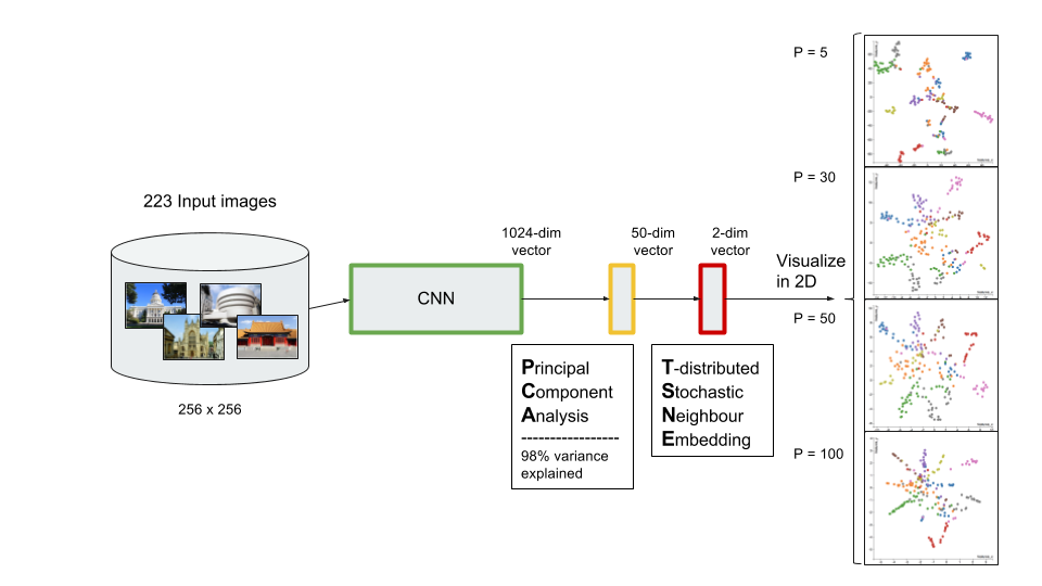 t-distributed Stochastic Neighbour Embedding (t-SNE) A feature of t-SNE is a tuneable parameter, perplexity, which (loosely) translates to how the algorithm balances between local and global aspects of the data. Perplexity can be thought of as a guess about the number of close neighbours each point in your data has. The perplexity value typical ranges between 5 and 50, and has a very complex effect on the resulting plots as shown below. More information on how to tune the parameters and how to interpret t-SNE plots can be found here. Two important takeaways from the linked post is that cluster sizes in a t-SNE plot have very little meaning, and measuring the distances or angles between points in these plots do not allow us to deduce anything specific and quantitative about the data. It is difficult to draw any concrete conclusions from the t-SNE plots with different perplexities, but we can see that the clusters that are generated do split up the images fairly well based on their architectural style. The clusters are also quite similar to those generated by the variational autoencoder with an apparent radial shape at higher perplexities. Conclusions Neural networks are great tools for pattern recognition and image classification, but often times they are considered "black boxes" in that the results can be difficult to interpret. The two dimension reduction techniques I have discussed in this post are excellent ways to visualize the important features that a convolutional neural network uses to perform their classifications. A next step for this project would be to increase the number of target classes and train the CNN and VAE with more images. It would be interesting to explore how the VAE will find representations in 2D space when there are much more target classes. I've also touched on how to create compelling 2D mappings from high-dimensional data using t-SNE. A strength of t-SNE is being able to find structure where other dimensionality-reduction algorithms cannot, but a good intuition on how t-SNE works is needed in order to avoid misinterpretation of the plots. To view the code for this project, please refer to my GitHub page.
3 Comments
 Apple's New iPhone X Apple announced their new iteration of the iPhone in their keynote back in September, and the general public wasted no time voicing their opinions on social media (particularly on how the new Face ID "failed" during the keynote demo). For those of you who didn't catch the keynote, the new iPhone X comes with a bunch of new features, including a glass back to allow for Qi wireless charging, and Face ID which replaces Touch ID as the new way to unlock your phone and pay with Apple Pay. Consumer opinions on these new features were quite polarizing, with some praising Apple for the phone's sleek all-glass design, while some complaining about its apparent fragility. What if there was a way for Apple to determine the initial response prior the the phone's release? For my fourth project at Metis, I wanted to aggregate and analyze consumer sentiment based on YouTube comments using natural language processing and clustering methods to gain some insight on what people think about the features of the phone. Method For this blog post, I will focus on the process and the results from my analysis. The code for this project can be found on my GitHub page. In order to analyze sentiment on the different features of the iPhone, I needed to cluster the YouTube comments based on topics. The method I used to achieve this is as follows:
Scraping YouTube Comments To obtain my data, I scraped all the comments from the top 10 English-language YouTube videos based on view count using the YouTube API, stored the raw JSON in a Mongo database, and unpacked the JSON into a dataframe containing 60,000+ comments using Pandas.  Pandas DataFrame Text Pre-processing Now that I had my comments in a manageable dataframe, some of the text-preprocessing considerations I took were to remove stopwords, punctuations and stem the words using Natural Language Toolkit (NLTK) methods. Using sci-kit learn's TfidfVectorizer I further ignored uncommon terms by setting the minimum document frequency (min_df) parameter and created a weighted comment-term matrix shown below containing almost 2,500 columns of 1 to 3 word n-grams. To avoid the so-called "curse of dimensionality" when applying clustering methods to high-dimensional spaces, this sparse matrix needed to be reduced to a lower dimensional semantic space, allowing us to make valuable conceptual comparisons between comments without losing too much information after the dimension reduction takes place.  Sparse Comment-Term Matrix Latent Semantic Analysis & Clustering To reduce the comment-term space into a 300-dimensional semantic space, I used GENSIM, an open-source vector space modeling and topic modeling toolkit, which contains a module for Latent Semantic Analysis/Indexing (LSA/LSI) in Python. LSI performs a Singular Value Decomposition (SVD) on the comment-term matrix with TFIDF weightings to map all the terms in the corpus into a reduced term space and all the comments into a reduced comments space, and allows us to make arbitrary comment-to-comment comparisons using cosine similarity. Since every comment is the weighted sum of all of its terms, I can also use unsupervised learning to cluster my comment vectors into similar topics. The clustering algorithm I used was K-Means clustering, and to determine the number of appropriate clusters I analyzed the inertia scores and average silhouette coefficient scores. Inertia, or the within-cluster sum of squares criterion, can be recognized as a measure of how internally coherent clusters are and is a metric that we aim to minimize. A silhouette coefficient score, on-the-other-hand, relates to how defined your clusters are and is a metric we aim to maximize. Although the inertia plot below does not show a clear "elbow", I chose to use n = 17 clusters since there appears to be a local maximum average silhouette score. 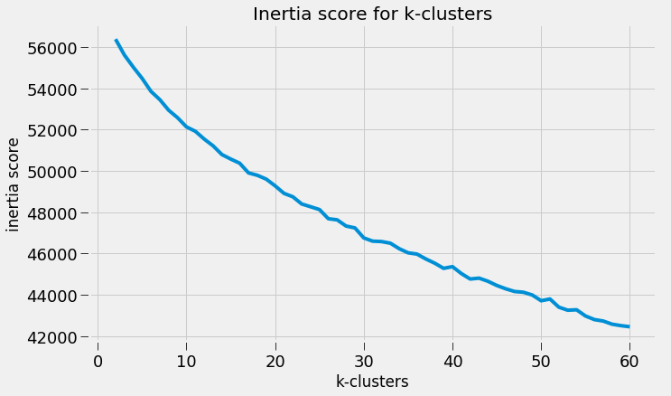 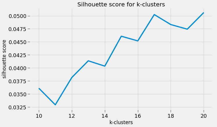 Sentiment Analysis After manually looking at comments in the different clusters, I determined the topic of each cluster and have shown some of those clusters in the picture below. In particular, I wanted to focus on analyzing the sentiment on the features of the new iPhone and decided to focus on three features: Face ID, Wireless Charging, and Aesthetics. I applied two different sentiment analysis tools (TextBlob and VADER) on the YouTube comments in these three topics to validate the results. 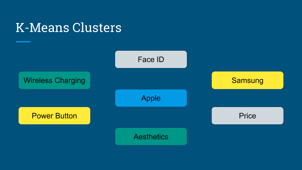 The below pie charts show the results of the sentiment analysis (the green slice represents positive comments, red represents negative, and blue represents neutral). For TextBlob, a comment is considered positive if the polarity score is positive, negative if the polarity score is negative, and neutral if the polarity score is equal to zero. The same method is applied to VADER for its compound scores. 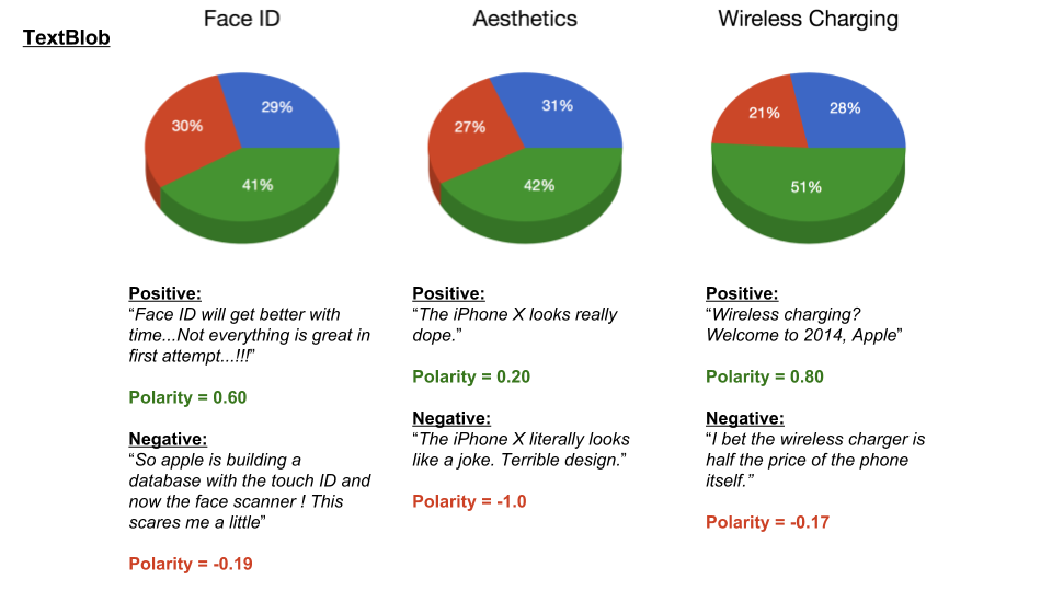 TextBlob Sentiment Analysis In the above picture, I have shown some of the comments and their corresponding TextBlob polarity scores. At first glance, the pie chart would suggest that the majority of comments related to the iPhone's wireless charging capabilities are positive, but if we look at the example positive comment ("Wireless charging? Welcome to 2014, Apple"), we can see that TextBlob does not detect sarcasm very well giving this particular comment a polarity score of 0.8. Below are the results from the VADER sentiment analysis and I have shown the same comments and their corresponding VADER compound score. Looking at VADER's results, it would appear that the comments related to the phone's aesthetics are mainly positive, but if we again look closely at the sample comments below, we can see that the clearly positive comment ("The iPhone X looks really dope.") was given a neutral compound score, while the clearly negative comment ("The iPhone X literally looks like a joke. Terrible design.") was given a positive compound score. 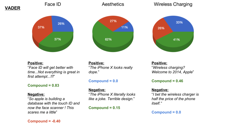 VADER Sentiment Analysis Conclusions In this post I’ve focused on my process of scraping YouTube comments, text-preprocessing and vectorization, clustering, and finally using two separate sentiment analysis tools to determine consumer sentiment on the features of the new iPhone X. The conclusion I can draw from the results is that although these sentiment analysis tools can give a broad snapshot of text sentiment, these methods are far from perfect. And even though there were a fair share of negative responses to the phone based on the YouTube comments, Apple can still rest assured that there will be people camped outside their stores at release to be the first to get their hands on their new products. Again, to view the code for this project, please refer to my GitHub page. My next blog post will be on my final project at Metis, where I use transfer learning to train a Convolutional Neural Network to classify a building's architectural style from images. Keep posted. If you live in the Bay Area, you may have noticed the smoky haze that covered San Francisco and the surrounding areas earlier this month. Caused by several large wildfires in the Sonoma County, it greatly reduced air quality and visibility, and made me, and many others, reluctant to go outside. You may have also heard in the news about the devastation of Santa Rosa (where the fire destroyed 3,000 homes causing $1.2 billion in damages) along with other communities in the Sonoma County. All the while, the cause of the string of wildfires is still unknown and under investigation. Problem Overview These recent events was my motivation for my third project at Metis, Project McNulty. For this project I aim to create a classification model to predict the cause of a wildfire given its features, and create a tool in the form of a Flask application that could help authorities determine the cause of a fire when reasons are unknown. This application would also be able to determine the highest probable cause of wildfires in a given location to help decision-makers take steps to mitigate the risk. The data I used for this project is a Kaggle dataset and it consists a spatial database of 1.88 million wildfire events that occurred in the United States from 1992 to 2015 and was generated to support the national Fire Program Analysis (FPA) system. Some of the information given for each fire event included the location, the discovery date, the cause, the size, and the containment date. 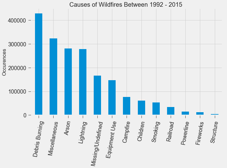 The above graph shows the distribution of wildfire causes in the 24-year period. We can see that over 700,000 cases of wildfires were attributed to two causes: debris burning and "miscellaneous". Debris burning are fires started by people burning trash, crops or other waste materials, and miscellaneous fires are ones that are started by anything that cannot be grouped in any of the other categories, such as fires started by electrical wiring or from other natural sources other than lightning. You can find the description of each category here. I also want to point out the missing/undefined category which I will write about a little later in this blog post. To tackle this dataset, I started with some exploratory data analysis. Exploratory Data Analysis 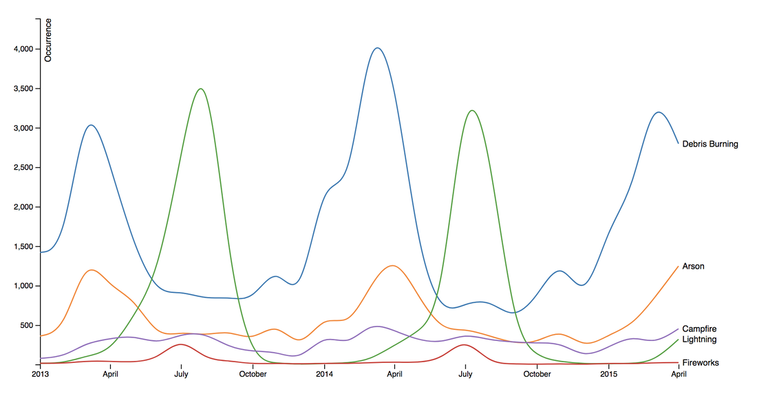 Wildfire Causes Between 2013 - 2015 The plot above highlights five causes of wildfires and plots their total occurrences over time, and by looking at the graph, it's clear that the causes are cyclical. Wildfires caused by debris burning and arson typically happen in late winter or early spring, lightning fires occur in the summer months, and perhaps not surprisingly, wildfires caused by fireworks occur in early July. There also seems to be no apparent pattern for wildfires caused by campfires, which is somewhat surprising. 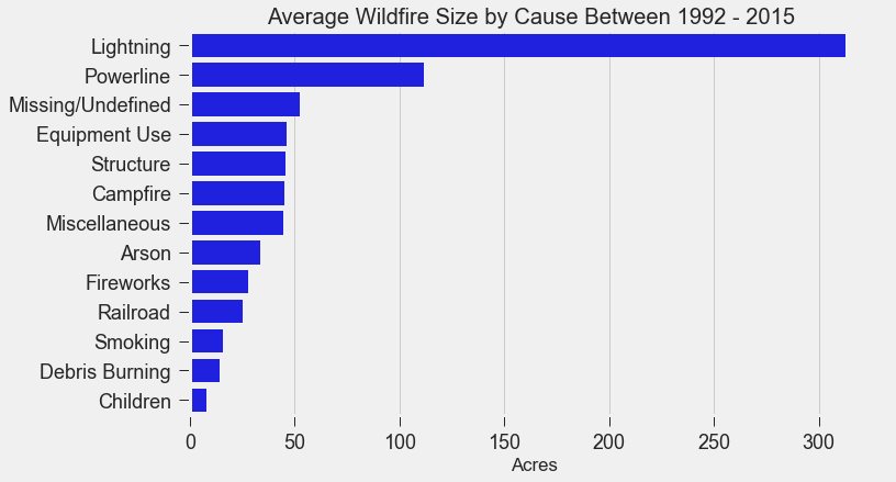 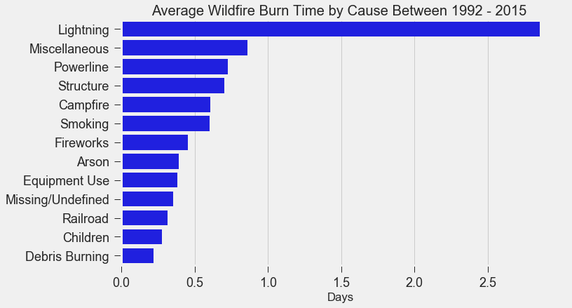 I wanted to explore whether the size of the fire and the number of days it took to contain the fire had any signal on the fire's cause. The above graphs indicates that fires caused by lightning and powerlines result in larger fires compared to fires caused by arson and debris burning, and that lightning-caused fires burns significantly longer other fires. These plots may indicate that wildfires caused by lightning have characteristics that make it easier to distinguish than others. Classification Metrics After trying different combinations of features on different models, the features that seem to have the most signal for the cause of wildfires, listed in order of importance, are as follows:
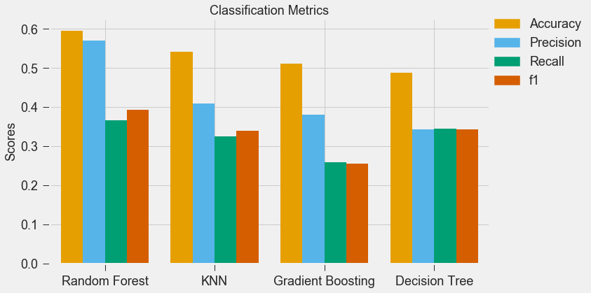 For my classification models, I chose to focus on K-Nearest-Neighbours and tree-based algorithms as these tend to work better with multi-class problems. By using sklearn's GridSearchCV, I tuned my hyper-parameters (k-neighbors, number of trees, tree depth, max features, min sample leafs, etc) and compared the classification metrics to determine the parameters that would yield the highest precision and recall, using macro averages. The graph above shows the results for different models with tuned parameters, where the random forest model seems to have obtained the best accuracy, precision and recall scores. 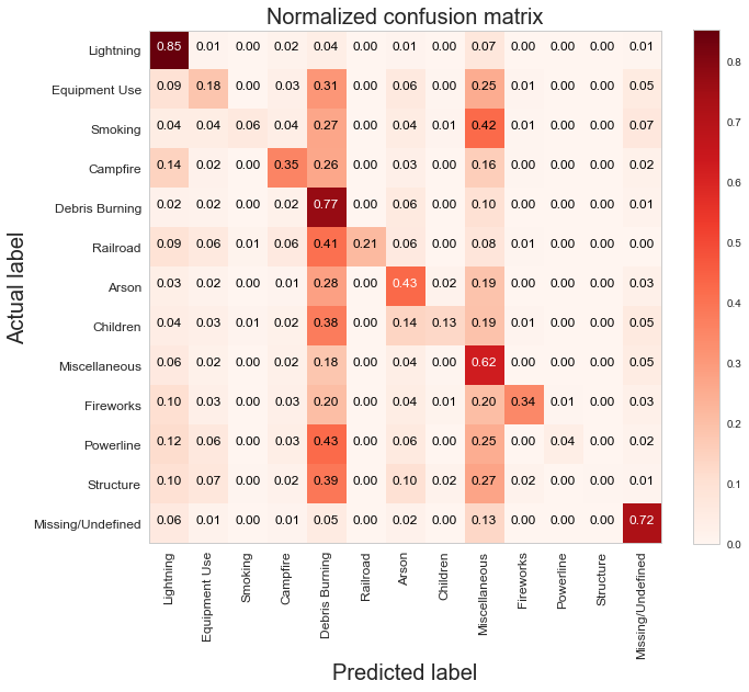 Confusion Matrix - Random Forest Model The above is the confusion matrix for my random forest model normalized to the actual class labels. From the confusion matrix, we can see that my model predicted a lot of false positives for debris burning and miscellaneous. What is interesting is that the accuracy for lightning class is quite high, with 85% of all events predicted correctly, and with much fewer false positives compared to debris burning and miscellaneous cases. This confirms my original hypothesis that lightning caused fires have characteristics that make it more distinguishable than other causes. If we take a look at the predicted versus actual label of the missing/undefined cases, we can also see that the accuracy is quite high, at 72%, with relatively low amount of false positives. This may suggest that wildfires with unknown causes may also share similar characteristics. Prediction of Missing/Undefined Wildfires To further explore these missing/undefined cases, I trained and fit another random forest model without the missing/undefined cases, then I used my trained model to predict on the missing/undefined cases. The graph below shows the predictions of over 70,000 missing/undefined causes of wildfires between 1992 and 2015, and shows that my model predicts almost 30,000 out of the 70,000+ cases of missing/undefined causes of wildfires are caused by arson, based on their location and fire characteristics. 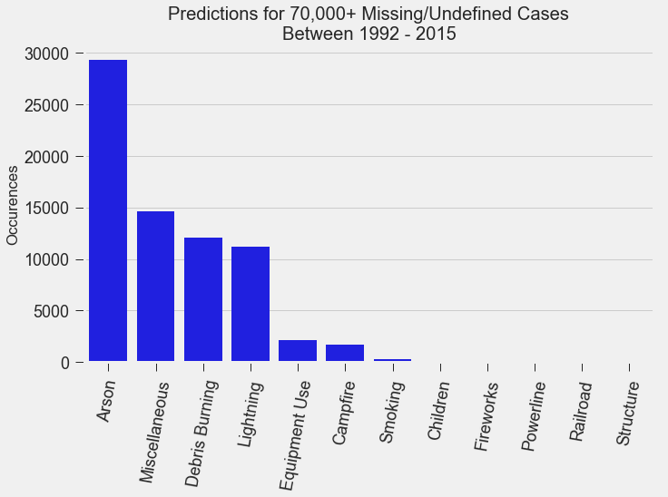 Prediction Application of Wildfire Causes Using this random forest model, I created an interactive Flask application to determine the highest probable cause of a wildfire for a given location, time of the year, days needed to contain the fire, and the size of the fire. I also created a d3 visualization of the total area of fires for a given US state as a proportion of the state's area. I will put links to those once I have it set up. The code for my analysis and visualizations can be found on my GitHub page. 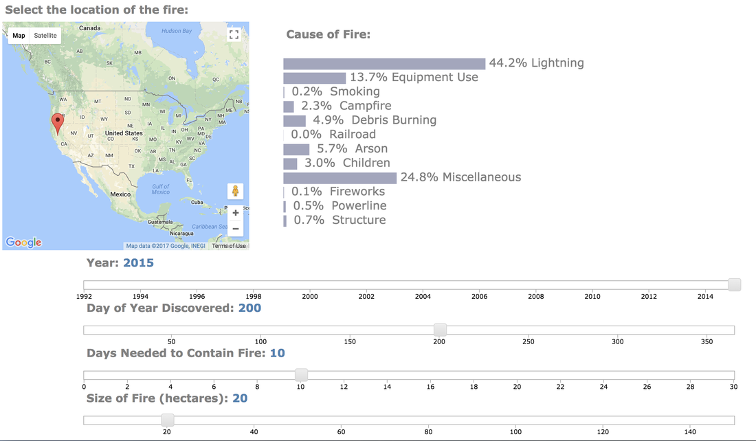 Flask Predictor Application 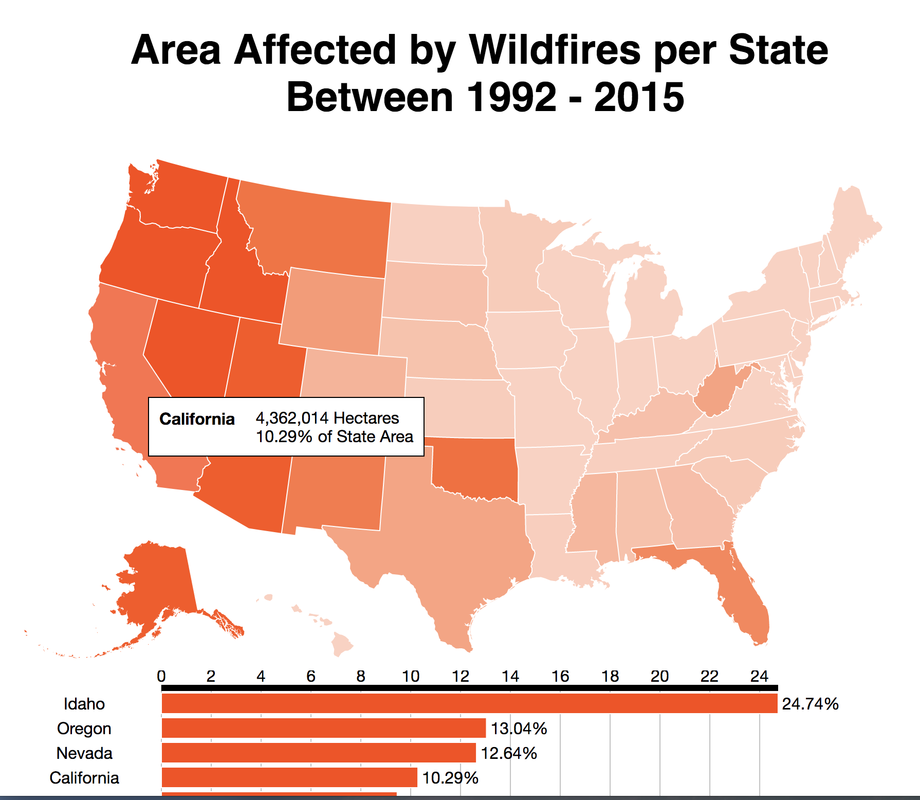 d3 Visualization Conclusions In this post, I've explored some defining characteristics of wildfires and discovered that wildfires caused by lightning may be more easily distinguishable due to its relatively larger size and burn time. I applied a trained random forest model to predict the 70,000+ missing/undefined cases of wildfires over the past 26 years, and the results show that a statistically significant majority of those fires were due to arson. My next blog post will be on my fourth project, codename Fletcher, where the main focus is to use unsupervised machine learning algorithms and natural language processing. The data I plan to use is comments from YouTube videos on the new iPhone X obtained using the YouTube API. By using Python's natural language toolkit (nltk) library, I will process the text data into vectorized data and use clustering algorithms to group the comments, and perform sentiment analysis to summarize each comment cluster to gain insights on how the public feels about certain features of the new iPhone. It's been almost a month since my last blog post, and I have yet to write about my results from my regression model for Project Luther. We have just finished up with our third project at Metis (codename McNulty), which had a focus on classification models, d3 visualizations, and Flask API and I am eager to talk about it in my next post, but for now I want to show some of my results from Project Luther. This is a continuation of my previous post, so if you have not read it yet, kindly do so before proceeding with this post. Recap To recap on Project Luther, my goal was to create a regression model to predict the effectiveness of an NBA player in their rookie season measured by their box-plus-minus (BPM). I had left off last post with determining colleges that have historically produced drafted NBA players with a higher rookie year BPM, with the restriction that the college needed to have produced more than 5 NBA players. I then ranked these colleges between 1 to 10 and gave players a ranking corresponding to the college they went to if they attended one of these top ten colleges, and 0 otherwise. More Feature Engineering Another feature I wanted to add to my model was how other players on the rookie's NBA team affect the rookie's BPM. To include this feature in my model, I needed to scrape the advanced stats data for all players in the NBA, for each team, and for each season since 2003, which proved challenging given team names change and franchises move cities. My solution for this problem was to first extract a list for all the URL extensions of each team in my time period (for example, /teams/GSW/2017.html for the 2017 Golden State Warriors). Once a had this list, I looped through my URL list to scrape the data I needed, again using BeautifulSoup. The features I created from this data was the Top 3, Top 5, Top 7 and Top 13 players' BPM for each team and each season, and I merged this data to correspond with the team and season a rookie played in. 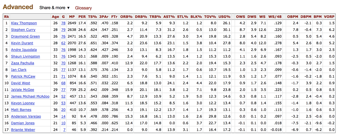 Advanced Stats for 2017 Golden State Warriors Regression Models Now that I have all the data and features I needed, including the college stats I scraped previously, I started training different regression models, using cross-validation methods and tuning parameters using sklearn's GridSearchCV. After trying linear regression models (Lasso and Ridge) and tree based models (random forest and gradient boosting), the best result I got in terms of R-squared was a multiple linear regression model with no regularization with an R-squared of 0.168. 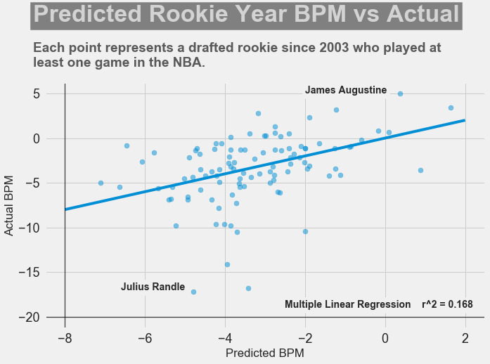 Conclusions I had gone into this project fully understanding that predicting an NBA player's effectiveness in their rookie season was a tough ask, but these results were frankly disappointing. I believe that one of the reasons why the model produced such poor results was the lack of data. Using an 80-20 train-test-split, my holdout set only had about 100 data points. Another reason, in my opinion, why the model did not have much predictive power is that a catch-all per-100-possession statistic like BPM is skewed for players who did not play many possession in their rookie season. Take the graph above, for example. Julius Randle played 14 minutes in 1 game and had a BPM of -16.8 in his rookie season while James Augustine played 7 minutes in 2 games and had a BPM of 5.0 in his rookie season.  NBA Draft 2017 So how can NBA general managers pick more Blake Griffins (38mpg 22.5ppg 12.1rpg 3.2bpm in his rookie season) and Kevin Durants (34.6mpg 20.3ppg 4.4rpg -1.4bpm in his rookie season), and fewer Kwame Browns and Anthony Bennetts? Well, I suppose if I had a simple answer to that question, I would be getting a lot of NBA teams leaving messages on my phone. Perhaps some other features I could have added to my model were a player's college star rating from recruiters. Another technique I can incorporate into this model is to determine a college player's "hype" from Twitter or basketball forums using natural language processing. Both of these features could perhaps give a better picture of a player's athleticism and potential. These are things I look to add to improve my model, but for the time being, the code for this project can be found on my GitHub.
In my next post, I will be going through my third project, a classification model to predict a cause of a wildfire in the US.
It's the end of week two, and things have definitely kicked into high gear. I wrote briefly in my last blog post about our project in Week 1 (codename Benson) where we used our newly acquired data munging skills to clean and map NYC MTA subway data into a more manageable form in order to more easily gain insights from the data. This week, we were introduced to our second project, codename Luther. The criterion for this two week project is quite straight-forward: scrape data from the web, and use the data to produce a regression model to predict a dependent variable. For my project, I decided to produce a model to predict the effectiveness of a rookie in their first NBA season based on their college statistics, physical characteristics, among other metrics. In this blog post, I will be talking about a few of the concepts and analysis techniques we learned this week, and how I have applied it to Project Luther.
Web Scraping The majority of the time this week was spent on scraping data from the web using the Python package, BeautifulSoup. The data I am using for Project Luther will be obtained from two sources: Basketball Reference for year-to-year statistics of drafted players in the NBA, and RealGM for college career average statistics in the NCAA since 2003. With only roughly 60 players drafted into the NBA each year, the number of drafted players in the NBA since 2003 is 798 players. However, many of those drafted players did not play in the NCAA (they were either drafted out of high school or from another country), and some of the players did not end up playing a single game in the NBA. After filter out these players, I ended up with a data set of 552 players with 117 features consisting of physical characteristics, average college statistics, average rookie year statistics, and average NBA career statistics. Problem Overview Using a combinations of these features, I plan to predict whether a rookie will contribute to their team in their rookie season. The metric I will be using for this prediction is Box Plus/Minus, or BPM. BPM is a box score-based metric for evaluating basketball players' quality and contribution to the team by taking a player's box score information and the team's overall performance to estimate a player's performance relative to league average. To give an idea of the BPM numbers you would see, 0.0 is league average, +5 means the player is 5 points better than an average player over 100 possessions, -2 is replacement level, and anything lower than -5 is really bad. Basketball Reference has a very detailed page on how BPM was derived by constructing a ridge regression model using a player's advanced statistics (such as True Shooting Percentage (TS%) and Assist Percentage (AST%)) from the 2001-2014 seasons as features and is worth a read through. 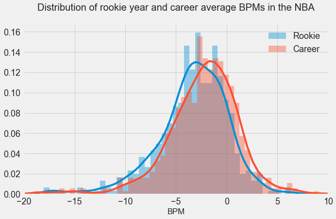
In the above graph, I have plotted the distribution of rookie season and career average BPM's. As we can see, the mean of the rookie year distribution is -3.43, slightly lower than the mean of the career average distribution in -2.52. As stated above, a player should be replaced if their BPM is less than -2 where a "replacement player" is defined as a player on minimum salary or not a normal member of a team's rotation. However, players below replacement level do frequently play, primarily for development purposes. Rookies are frequently below replacement level, but they end up getting playing time in the NBA in order to develop. Lebron James leads the league in terms of career average BPM with 9.1, and the highest single season BPM was put up by Russell Westbrook in the 2016-2017 season with 15.6.
Feature Engineering Simply plugging in college statistics into a regression model in hopes of finding some meaningful correlation for BPM may not be the best strategy, as there are many factors which may contribute to whether a rookie will perform well in their first NBA season. Historically, there have been certain colleges that produce high-level NBA players, and a player having played for that college may be an indicator of whether they make good NBA players. My method for taking this into account is to first determine the colleges that produce a higher number of NBA draft picks as well as producing rookies with higher BPM's in their first year. The below shows the 10 colleges and the average BPM of its draft picks in their rookie year for colleges that produced more than 5 draft picks since 2003.
Another factor for how well a rookie performs is which team they get drafted by. A rookie who is drafted into a team with a lower average BPM (ie. a not so good team) may perform better than a rookie who is drafted into a team with a higher average BPM, simply because they may have more opportunities to play. On the other hand, a player drafted into a better team may perform better since they are playing with better players. Perhaps there is no relationship between the two, but I would need to analyze the results before I can make a definitive conclusion. My focus for next week will be to prepare my dataset by scaling the features and making dummy variables. Taking all I have discussed above into account, I will create multiple regression models, use cross-validation methods, and also try random forests algorithms to see which model performs the best. Stay tuned. Hi. Welcome to my blog. In this first post, I am going to be talking a little bit about myself, why I chose to attend the 12-week immersive data science boot camp at Metis, my thoughts on the first week of the bootcamp and some of the challenges I have faced along the way. So, to start things off, some introductions. I'm Kenny. I was lucky enough to grow up in one of the most beautiful cities in the world, Vancouver. I studied Mechanical Engineering at one of the local universities, and since graduating, I have worked as a material handling engineer at an engineering consulting company in the mining and metals industry, and as a loss prevention consultant for a global insurance company. I recently came back from a year-long working-holiday in Australia, where I got to wake up to this every morning: 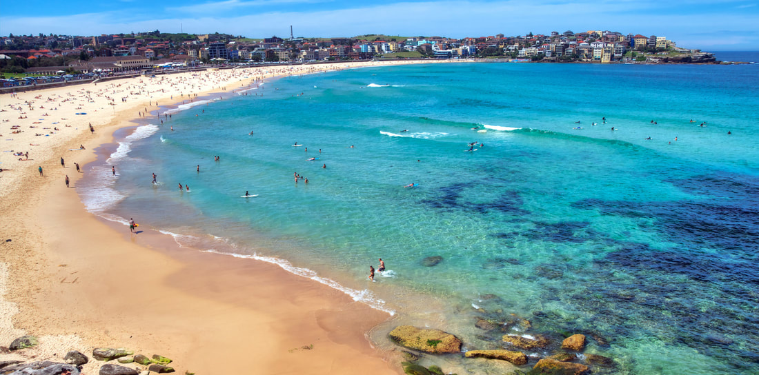 Bondi Beach, Sydney, AU That's Bondi Beach in Sydney, and my apartment was the turquoise building in the background. My time in Sydney pretty much consisted of drinking top-notch coffee, lazing on the beach, swimming in the ocean, and working on an awesome tan. It was pretty sweet. After living in Sydney for 9-months, which included quick stops in New Zealand and Fiji, I began my four-month long travels throughout the rest of Australia, into Southeast Asia, and finally to Taiwan and Hong Kong. Some of the highlights of the trip were snorkelling in the Ningaloo Reef, watching the sun rise over Uluru, exploring Angkor Wat, cruising Ha Long Bay, admiring the reflection of Inle Lake in Myanmar, and the extraordinary food in Panang, Malaysia. My year abroad allowed me to reflect on what I wanted to do career-wise moving forward, and particularly on what I didn't want to do, which was continue with engineering. I started to learn more about data science and machine learning and was amazed by all its capabilities, and excited about its untapped potential. I began researching paths I could take to pursue a career in this fascinating field. Through my research, I discovered Metis, a full-time, 12-week data science program where I could learn data science theory and techniques, as well as build a portfolio of projects to present to future employers. For me, the prospect of learning practical skills and having the opportunity to meet like-minded individuals was intriguing. In March of 2017, while I was still travelling Australia, I had an extremely informative phone conversation with the Director of Admissions at Metis, Amy Ramnath, who explained to me the entire application process and what I could expect to gain from the bootcamp. She also provided me with important resources aimed to build on my technical and statistical background. After that phone conversation, I was convinced that the people at Metis would do everything in their power to help their students succeed. I began brushing up on my calculus and linear algebra, took an online course on probability and statistics offered by Harvard, and learned how to use Python for data analysis/visualization and machine learning. When I arrived home in Vancouver in June of 2017, I started the application process with Metis in the hopes of attending the fall cohort in Seattle starting in September. The entire application process took around three weeks, and consisted of a technical assessment, a take-home coding challenge, an API challenge along with some exploratory data analysis using Python, and finally a Skype interview with a Senior Data Scientist at Metis. After being accepted into Metis, they provided me with additional pre-work to be completed prior to the start of the bootcamp, which involved a 60-hr online curriculum designed to ensure that students have the foundation skills to hit the ground running on day one. The first road block of this journey came three days before the start of the bootcamp, when I learned that due to an administrative error, I was unable to attend the bootcamp in Seattle. I was instead offered the opportunity to attend the cohort in New York or San Francisco. Luckily for me, I had family living near San Francisco and was able to make some last minute arrangements and fly to the Bay Area. Although the hiccup caused me to miss the first two days of the bootcamp, I was fortunate to have incredible project partners, who quickly brought me up to speed on the project and presentation due at the end of the week. The project had us exploring New York's Metropolitan Transportation Authority's turnstile data and to think of ways to extract insight from the data to benefit a business. It was a pleasure meeting the instructors, TAs, and the rest of the cohort. I was relieved when I found out how positive and bright my fellow students were, and I am eager to see what the next 11 weeks has in store for us. 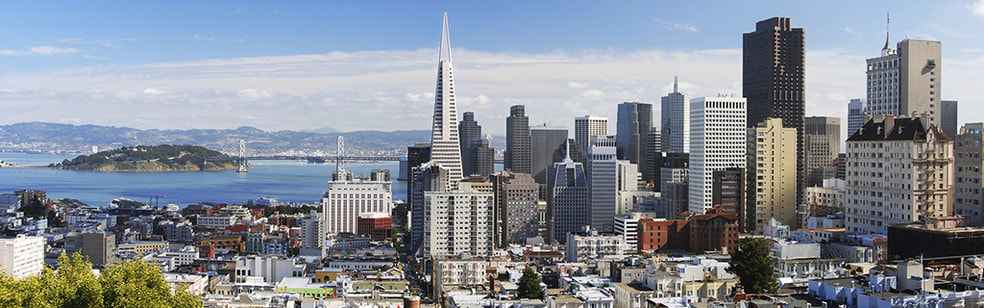 San Francisco, CA |
Kenny LeungPassionate sports fan, wannabe golfer, avid gamer and world traveller. Archives
December 2017
Categories |


 RSS Feed
